
What Brand of Car is KN? [You’ll Be Familar With the Answer]

I am a serial entrepreneur and a consumer advocate. When I’m not helping car buyers, I love working on ventures that have a positive impact.
I run a cause marketing agency and serve on the board of Vayu Global Health where we are disrupting the medical industry and preventing the needless deaths of mothers and babies during childbirth.
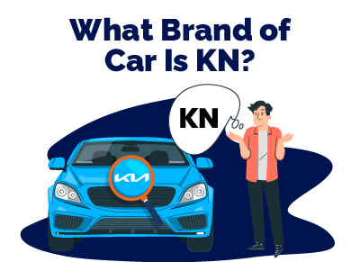
You’ve probably seen the new “KN” cars out there and wondered when this new car brand launched and why their cars look so much like something a hamster would drive (remember those commercials?)
It’s actually KIA.
You’re not alone in your confusion. Since their recent logo redesign, KIA (or KN now) has been getting some (possibly well-deserved) flack for the confusing font choice.
In fact, 30K people are searching for KN on Google! Common search terms include things like, "what car brand is KN", "who makes KN cars", and "what logo has the initial of KN".
Table of Contents
Did Kia Redesign Their Logo?
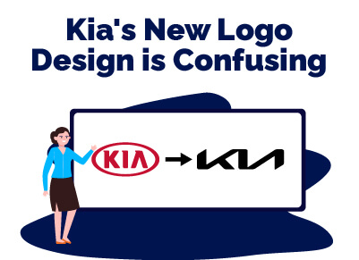
You’re not going crazy, Kia did redesign their logo recently.
The old logo was a simple red “K I A” printed in a blocky font with no middle line across the A.
The new one is sort of italicized and edgy, with all of the letters connected. And, yeah, it kind of looks like a KN.
When Did Kia Change Their Logo?
Kia introduced their new italicized logo at the beginning of 2021 to coincide with the launching of new products like the Telluride, K5, and EV6.
Why Does it Look Like KN?
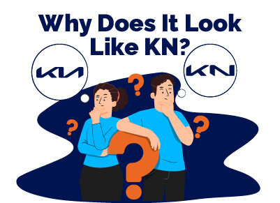 The new Kia logo looks like a “KN” thanks to the font and the design that features all of the letters touching.
Since the top arm of the “K” connects to the “I” which then immediately slopes into an “A” with no center line, it actually looks like a K connected to a mirrored “N.”
What Does Kia’s New Logo Look Like?
In case you haven’t seen it, Kia’s new logo features italicized, slanted, blocky letters.
The end of the top corner of the wide, leaning “K” drops down directly into an “I.” The “I” then slopes right up into an upside-down carrot. Well, it’s an “A,” but there’s no middle line so… you see the issue here?
Because of this lack of separation between letters, people are understandably seeing it as a “KN” instead of a “KIA.”
Though once you hear it’s actually KIA you can see it, it’s just kind of weird.
Why Is the Kia Logo So Confusing?
 It’s confusing because of how fluid it is. We don’t get any dot or extra line to clarify the “I” or the “A,” which we didn’t have in the old Kia logo, but now all of the letters are mashed together, so it’s even harder to understand.
But they were going for something here.
The goal of the redesign was to make the logo seem fluid, dynamic, and futuristic. It came with a fun new slogan, “Movement that inspires.”
This redesign is a part of a larger plan that Kia is working on to secure a leadership position in the future of mobility.
What Is KN Car Logo?
KN car brand is… not a real thing.
Kia’s new logo looks like a “KN,” leading some to believe that a new, exciting KN car brand is on the market, but it’s really just Kia.